At Pattern Bliss blog I'll be sharing my favorite surface pattern design inspirations, trends, a sneak peek my pattern designs, my favorite shoes, and, of course, cute dog pictures. Plus you'll get a glimpse of what goes on inside my studio in my sketchbook series.
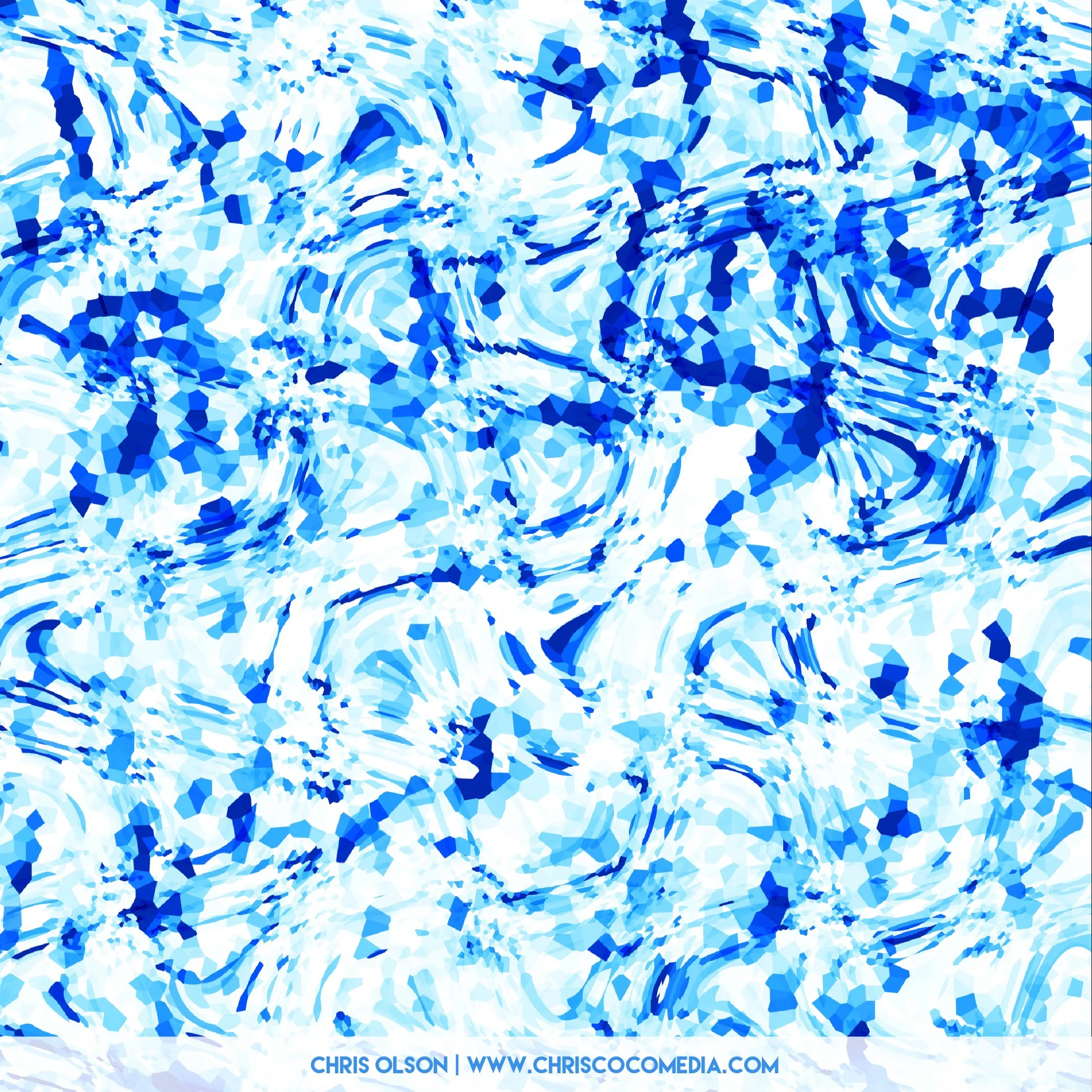
My Kahula textile design is a mix of geos, sunshine, and waves. Featuring only the happy blues.
I designed this pattern to add positive energy and fun to your workout with unexpected prints feature a mix of modern basics with bold blue hues. It is part of a textile collection for activewear.
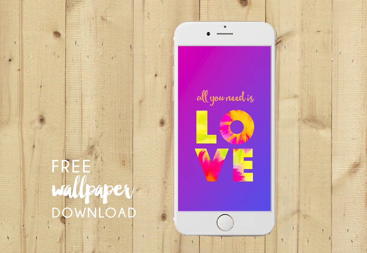
My patterns are available for purchase on my website. Access to my online client portfolio is available to manufacturers, licensees, art directors, etc.
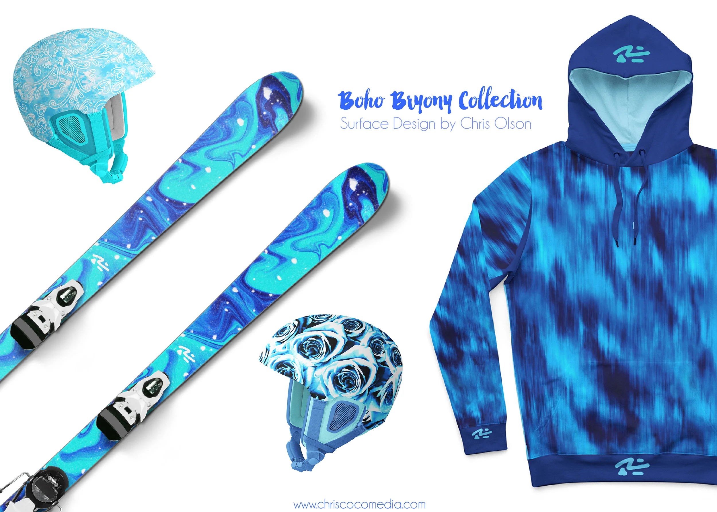
I'm passionate about wellness and setting aside some time every day to get outside to play. As a designer, my patterns are inspired by the outdoors--especially the way light plays with colors at such a high elevation here in Colorado. One of my favorite things to do for design research--and for fun--is to pack up my ski gear and head to one of the nearby resorts--Breckenridge, Beaver Creek, Vail, or Keystone.
My new design collection, Boho Bryony, was created with activewear in mind. When I design a textile I'm thinking about how the colors and patterns can be energizing or calming. Often my inspiration for a new design comes from photos I take while skiing, hiking with my dogs, or exploring new places. I'm always looking at what people wear and what colors, patterns and designs flatter the body. I am that girl who stops someone in line getting coffee and asks "where did you get that great parka?"
One of the best parts about social media is the ability to connect with a community. I have been a regular contributor to Instagram and other social media platforms over at Pattern Observer. I’ve also had the pleasure of creating graphics, presenting webinars and writing for the Pattern Observer blog
Recently I worked with Michelle Fifis over at Pattern Observer on a photo challenge on Instagram. The photos posted by designers and photographers in the community are beyond lovely—check them out on the Instagram hashtag feed #POpaperplay.
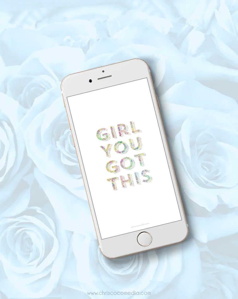
Check out my Society6 shop for gifts that give back. You'll find my artwork on pillows, iPhone and laptop cases, hoodies, t-shirts and more. I donate 100% of my proceeds from this Society6 shop to the Michael J. Fox Foundation for Parkinson's Research.
For me pink has always been cool. To be perfectly honest, I just like almost every color except that weird avocado color of the 60s. I do like the vegetable though. Getting back to the main point, Pantone announced their Color of the Year for 2016! This year Pantone actually has two colors a warm Rose Quartz and tranquil Serenity. This lovely combo finds it's way into my design work frequently and now my clients think I'm psychic--or maybe just kinda obsessed with colors associated with cake frosting, donuts, and weddings, birthday parties. Anyways. I am happy. Great work Pantone.
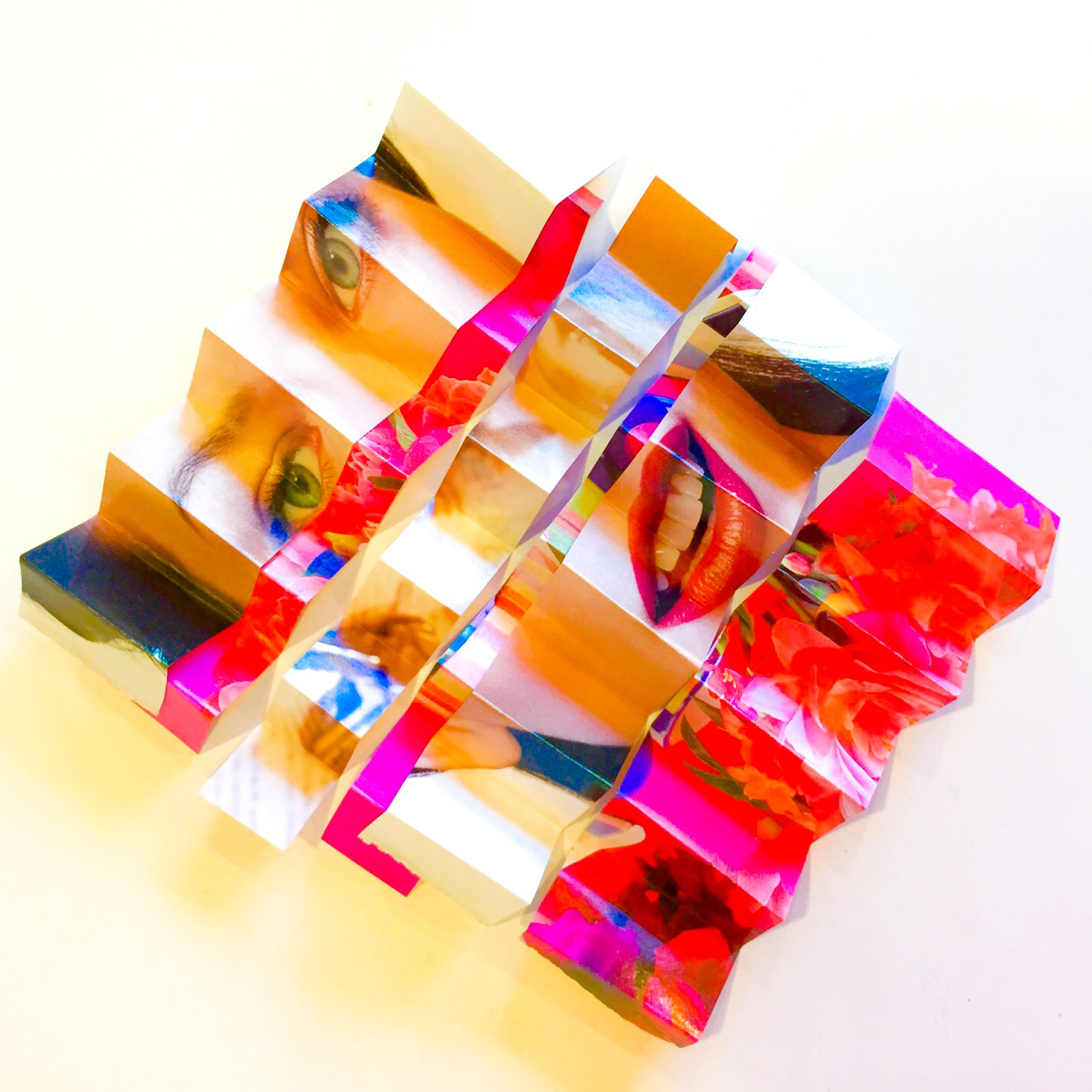
I’m cohosting the #POpaperplay Photo Challenge over at @PatternObserver on Instagram. Check it out. It’s Day 1 of the challenge. Feel free to join in and tag your photos. When you post an image, hashtag it #POpaperplay AND the daily prompt. We will #regram favorites every day at @PatternObserver. Here are the daily prompts. Day 1: #foldedpaper, Day 2: #crumpledpaper, Day 3: #tornpaper, Day 4: #curledpapershapes, Day 5: #handcutpaper, Day 6: #mixedmediapaper, Day 7: #papercollage
A few of my sketches for InkTober. This fun social-media campaign for artists was created by the Utah-based artist Jake Parker and it encourages artists to share their drawings every day in October.